Created using Adobe Illustrator and Adobe Photoshop.
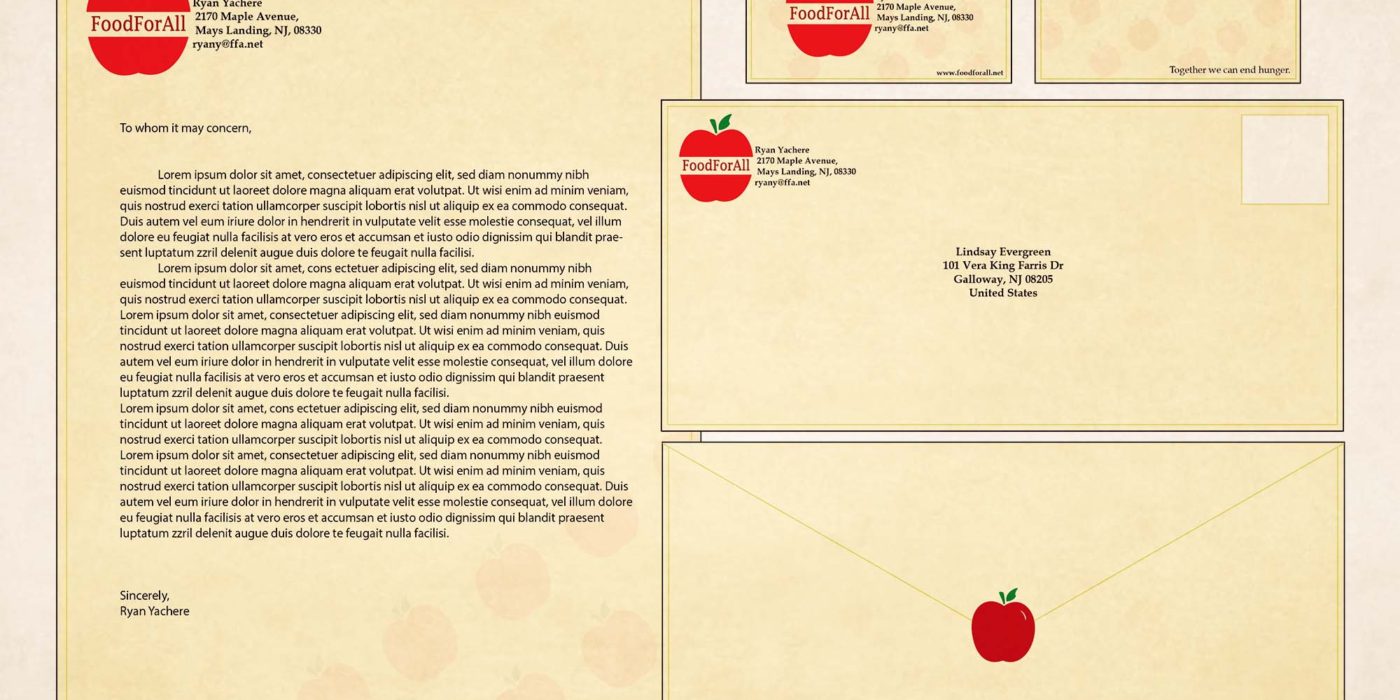
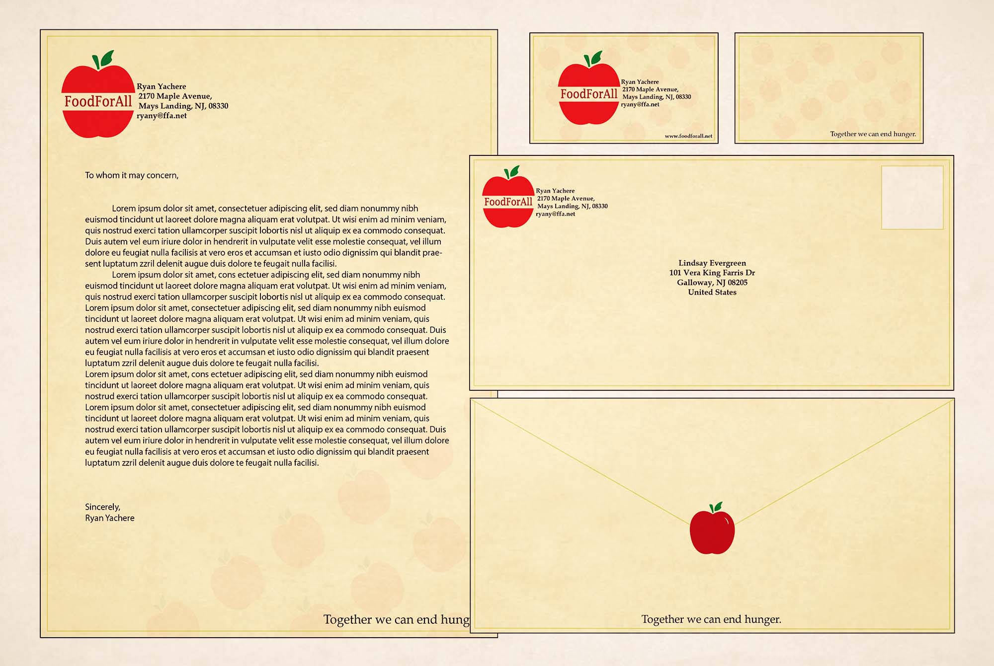
Both the Stationary Set and Style Guide are related to the two posters that represent food waste. The Stationary Set is presented as how my logo, tagline and wording would appear to clients if it were a real company. Same goes for the Style Guide since its presented how the logo and tagline would be shown on various objects and with different colors.
