Showing 20 Result(s)
port republic pamphlet

Port Republic 385th Anniversary Pamphlet

Created using Adobe InDesign. This is a pamphlet design to celebrate the 385th Anniversary for Port Republic, located in New Jersey. I worked on designing this pamphlet with two other students for the mayor of Port Republic. The mayor supplied us with the photographs and the text to add into the pamphlet while we worked …

art gallery logo 1

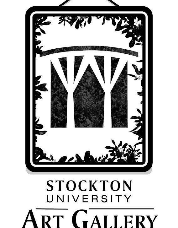
Stockton University – Art Gallery Logo Designs

Created using Procreate and Adobe Illustrator. These are four logo designs I created for Stockton University’s Art Gallery. I designed the picture frame using Adobe Illustrator and placed the text underneath it while also using Procreate to change the texture of the logo. It’s a simplistic design, but it also represents how creative the work …

comic book front and back cover

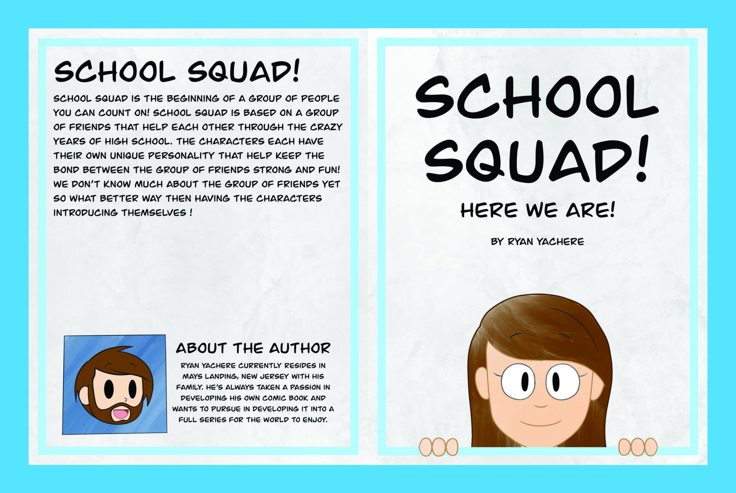
Comic Book Design – School Squad!

Created using Procreate and Adobe Illustrator. This is a comic book I made while using my original character designs. The comic book introduces each character, two pages per character, while representing their personalities and characteristics. The panels were created on Adobe Illustrator while the characters, background, text and other aspects of the comic were created …

Stamp Design: Japanese Culture

Created using Adobe Illustrator and Adobe Photoshop. The stamp was designed to represent Japanese culture. The use of pink and purple tones helped keep the image warm and cool while giving it a soft appearance. Pagodas and Cherry Blossoms are big icons in Japanese culture. The pagoda has a transparent effect while the cherry blossoms …

Beer Promotional Poster

Created using Adobe Photoshop. Both posters were designed for my beer, “Devil’s Kiss”. They were presented as promotion posters to promote the brand for consumers. Both posters used one word that could be used for two different meanings. Sit back and chill meant to sit down and just relax while also feeling the ice cold …

Word Image

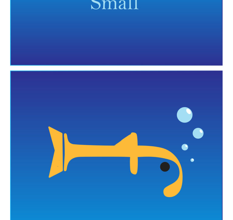
Created using Adobe Illustrator. Both pieces are depicting one object using a word and one letter that is turned into an image. The top panel of each image is one word that is presented using visual concepts to enhance its meaning while the bottom panel is using one letter that is the beginning of the …

Stationary and Style Guide

Created using Adobe Illustrator and Adobe Photoshop. Both the Stationary Set and Style Guide are related to the two posters that represent food waste. The Stationary Set is presented as how my logo, tagline and wording would appear to clients if it were a real company. Same goes for the Style Guide since its presented …

Beer Bottle Design: Devil’s Kiss

Created using Adobe Illustrator and Adobe Photoshop. Our senior class chose the name, “Devil’s Kiss”, to be presented as either a beer bottle name or brewing company. I chose to use the name as a beer bottle name and designed the labels as well as the box the beer bottles are placed in. When you …